A brand should feel like the place it belongs to
Every identity we build starts with the business itself: the room, the food, the name, the people it's for. The logo, colors and type come out of that, so the brand looks like no one else's.
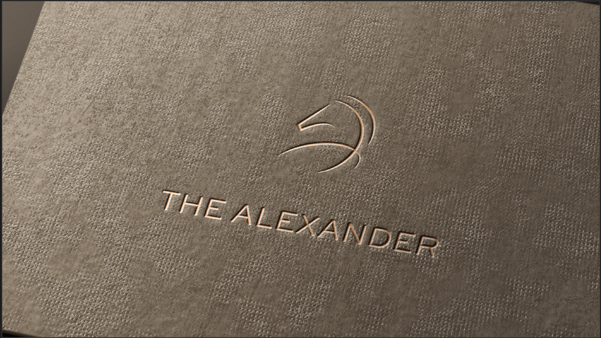
The Alexander
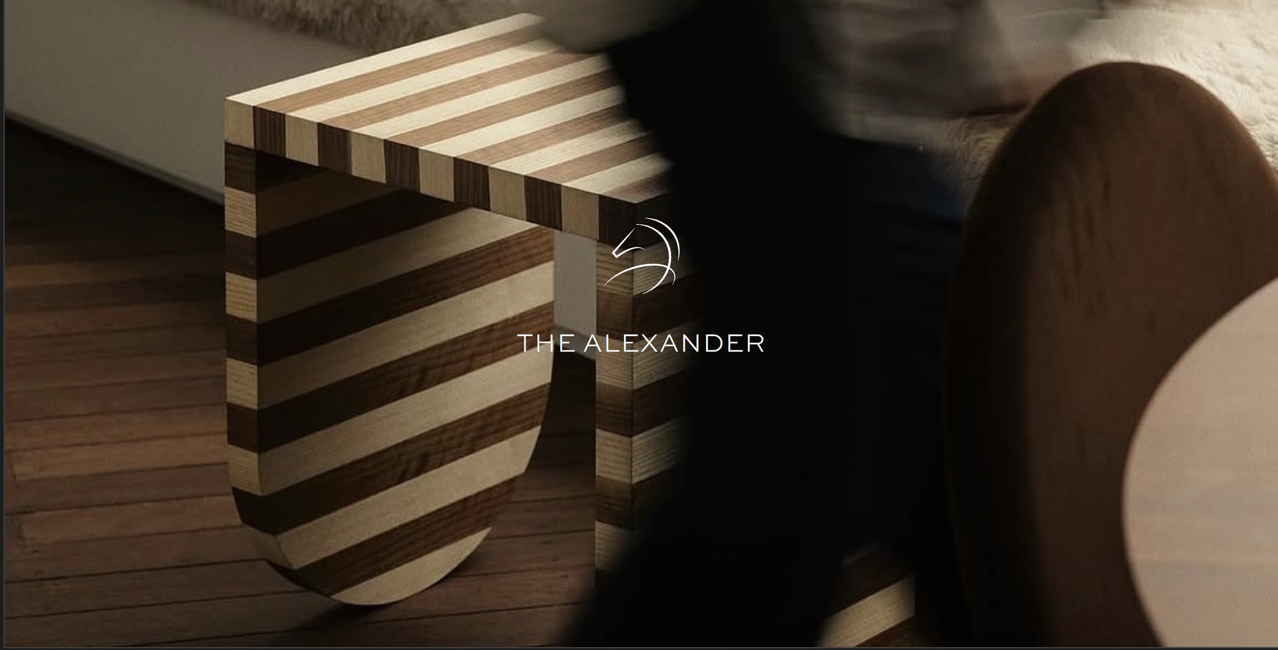
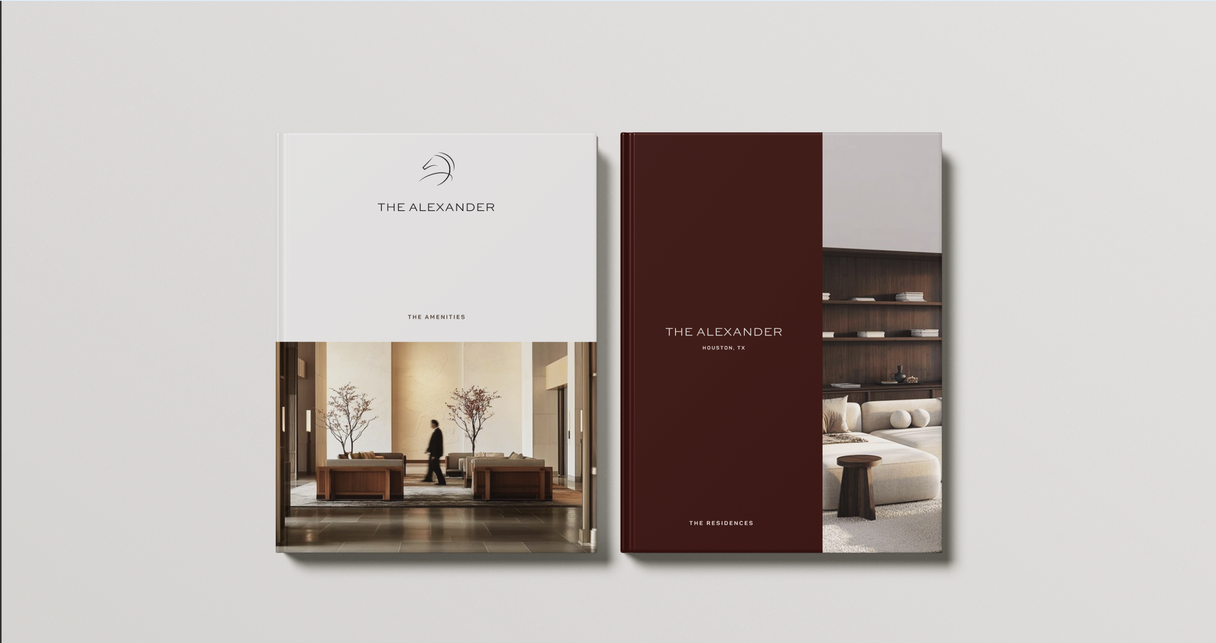
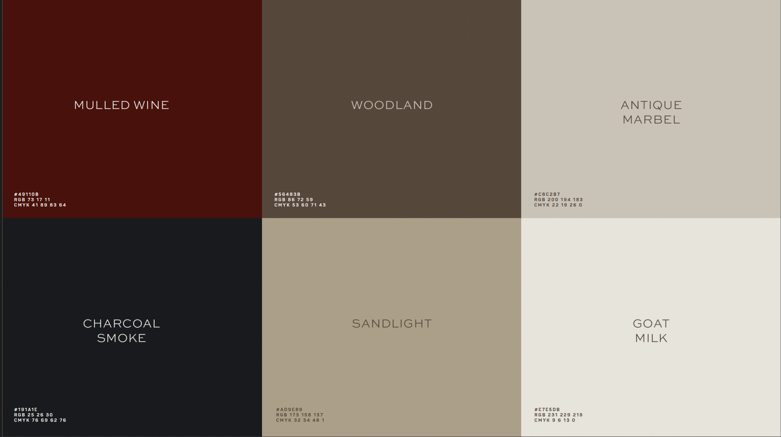
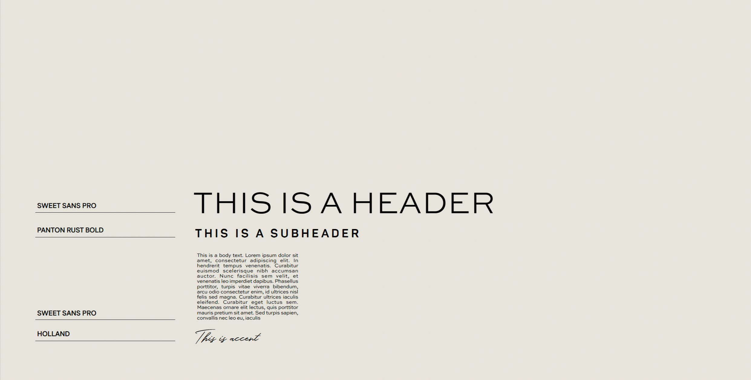
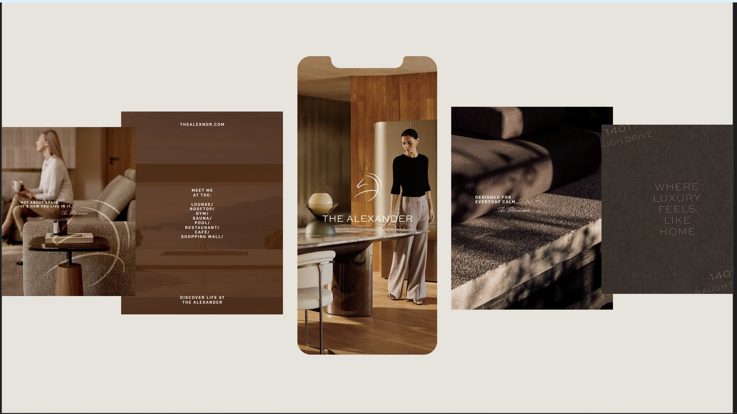
The Alexander is boutique luxury living in the heart of Houston, built on one idea: quiet luxury, thoughtfully lived. Where others sell luxury as spectacle, The Alexander offers it as a way of living, so the brand is calm, confident and never loud. The mark begins as a cursive "A," drawn in a single continuous stroke, and resolves into the neck and head of a horse: a symbol of leadership, nobility and contained strength, and a nod to Alexander the Great. A warm, earthy palette of deep wine, woodland brown, sand and marble carries that same feeling of home, summed up in the tagline "Where luxury feels like home.”

No Diggity
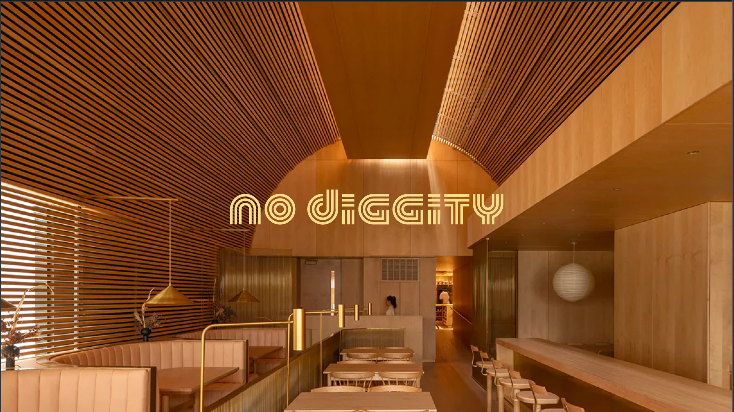
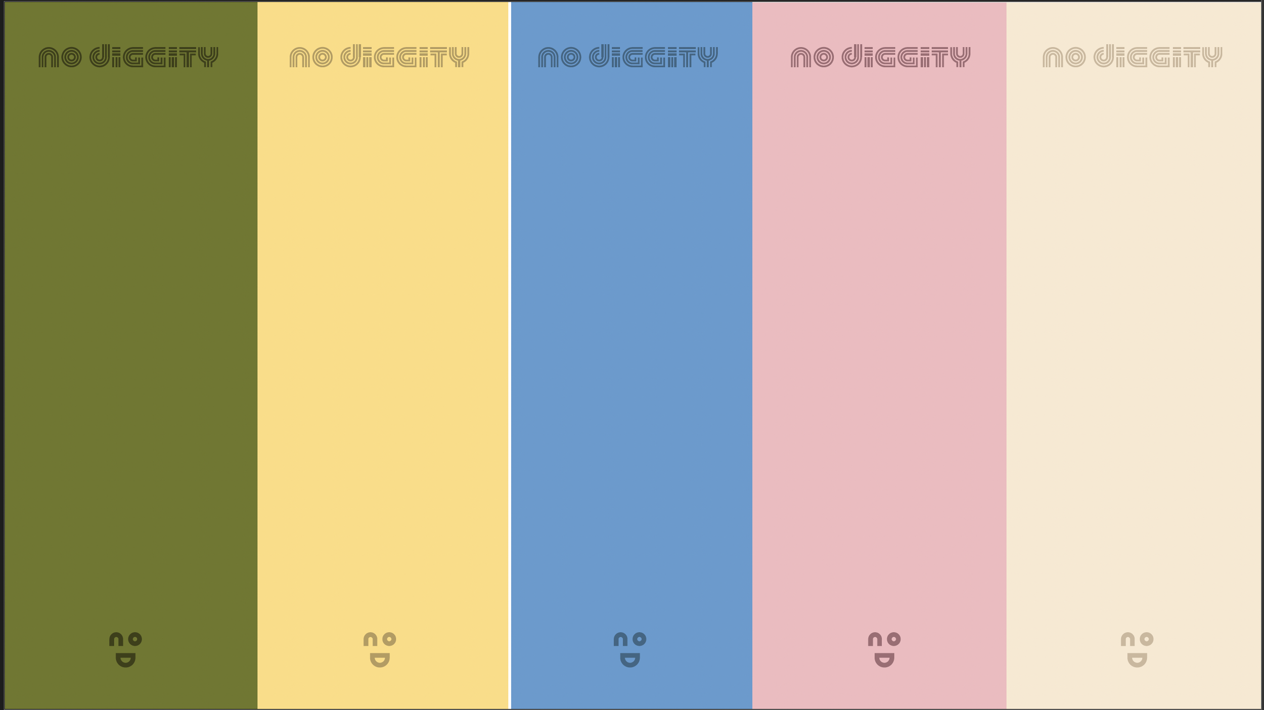
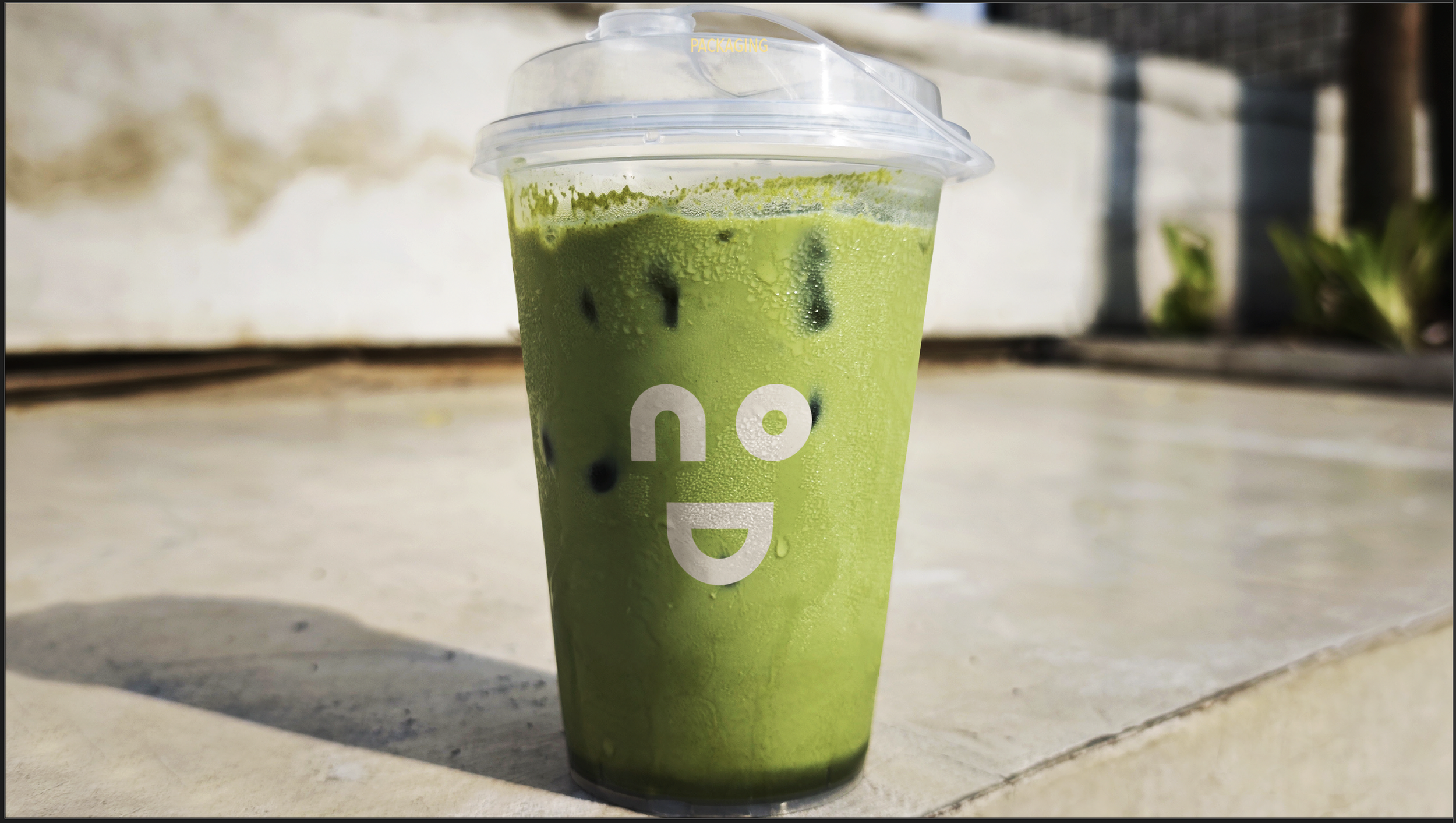
No Diggity isn't just a bar; it's a place where you drink the rhythm. The identity starts with the architecture of the space itself: repeating lines, enveloping curves and light that flows. The logo turns that into graphics, with letters built from continuous lines that evoke sound waves, pouring liquid and constant movement. It isn't meant to sit still, and it comes with a smiling icon drawn from the same lines for cups and small spaces. A palette of olive, golden yellow, denim blue, blush and sand keeps the brand as playful as the name.
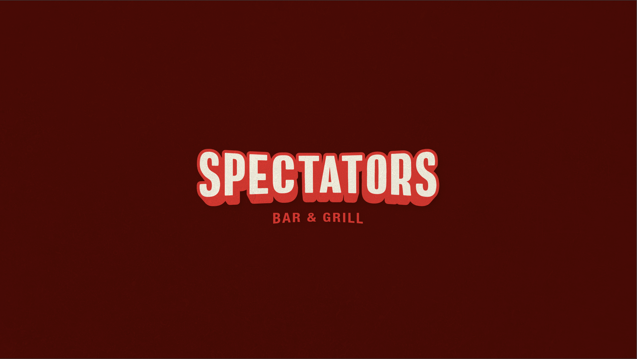
Spectators
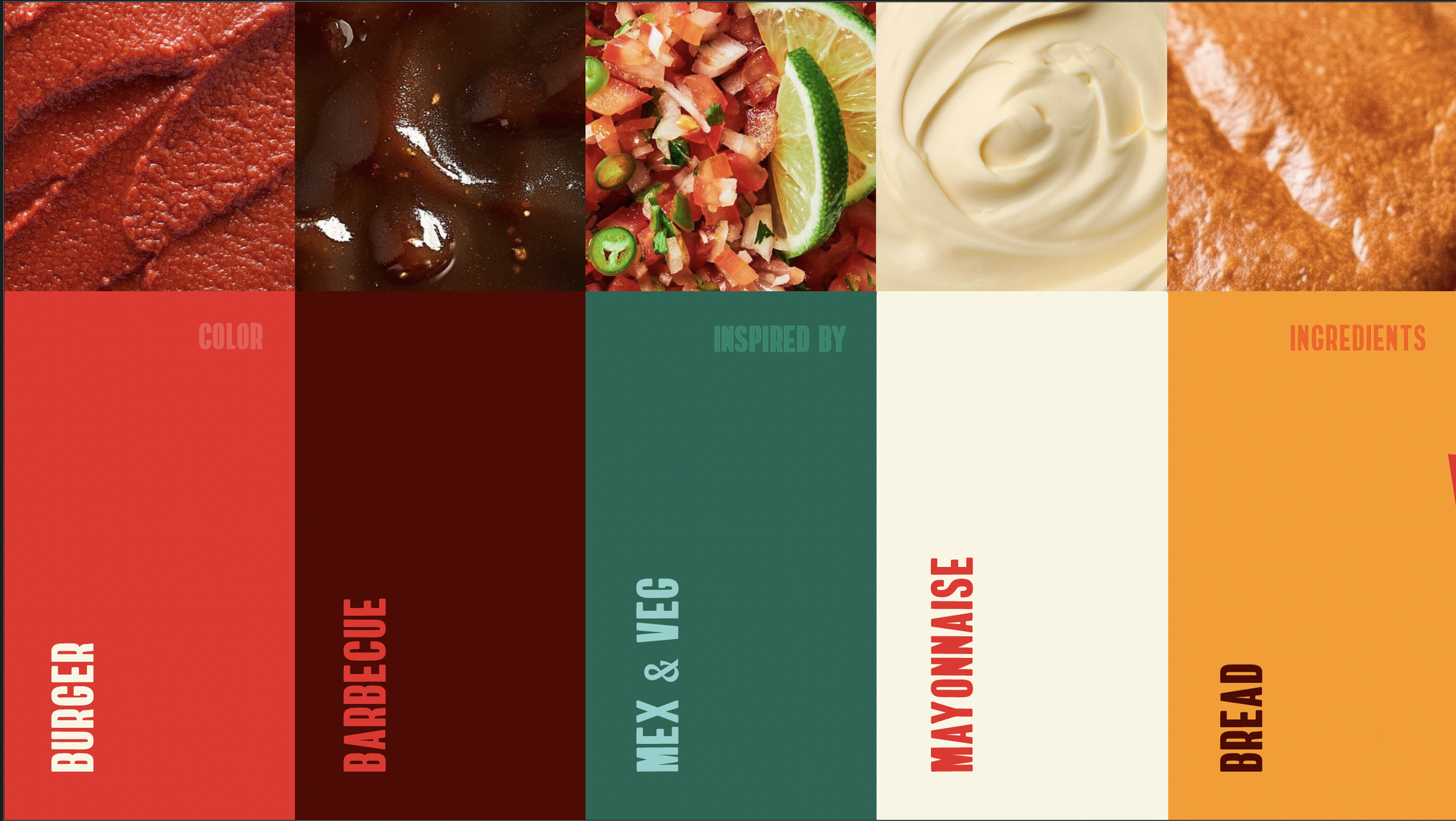
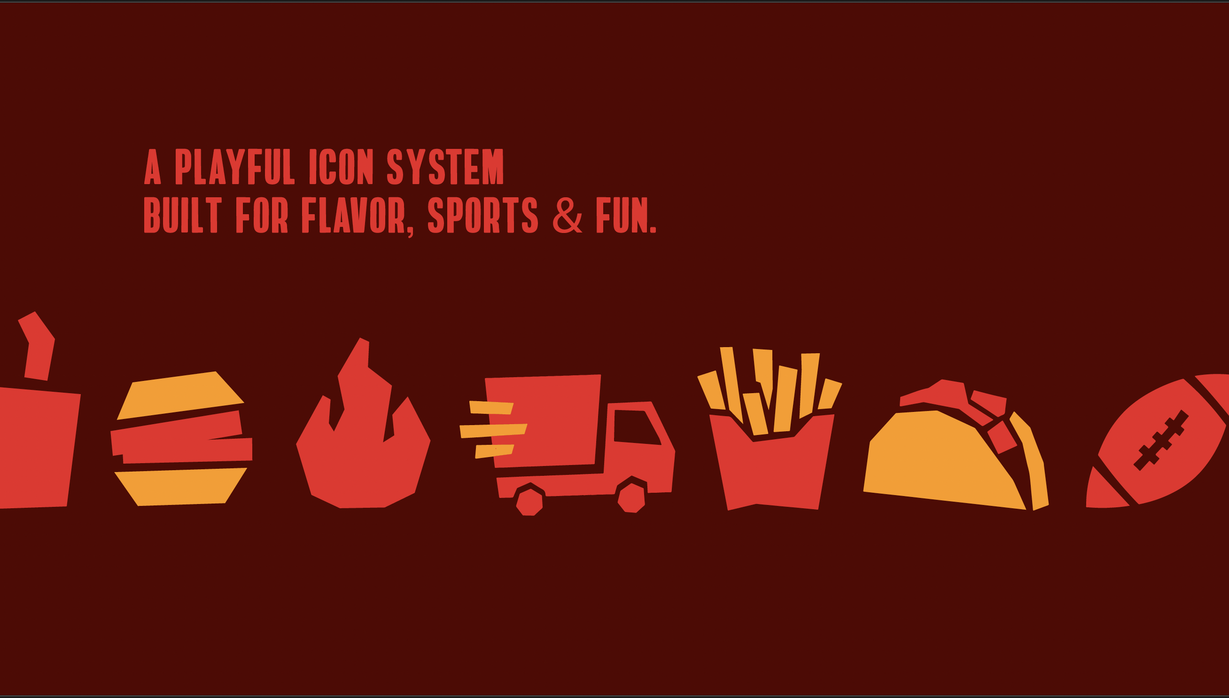
Spectators is more than a sports bar. It's a place for good food, shared moments, game-day energy and everyday fun, so the identity is bold, playful and family-friendly. The lettering takes a sporty, editorial feel and makes it sleeker and more modern: not delicate, but striking, direct and memorable. The colors come straight from the kitchen, with burger red, barbecue brown, a fresh green, mayonnaise cream and toasted-bread orange. A set of playful icons for flavor, sports and fun, and taglines like "Come for the game. Stay for the table," finish a brand that feels as fun as it is flavorful.